
Mobile Website Design Services in Calgary
Home » Mobile Website Design
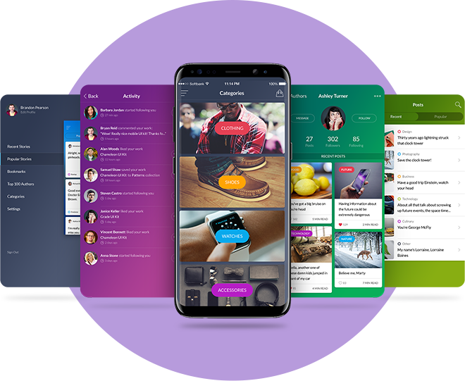
Most of the browsing nowadays is done from smartphones
Mobile Websites
Most of the browsing nowadays is done from smartphones
We’ve all been there, and we can all agree how frustrating it is having wasted precious minutes looking to reach out to a company that should want your business, and should do everything in their power to ensure that you can reach out to them as effortlessly as possible.
Most companies nowadays have a website, as your website is the face of your business and your best representative and advocate in the vast world of search engines and digital platforms. But, simply having a website is not enough, if that website is NOT mobile friendly.
Most of the browsing nowadays is done from smartphones, so your website needs to conform to your client’s preferred browsing methods while having the same look, functionality and navigability as your main website. This means having a responsive site, that is scalable to different screen sizes. Delivering a less than optimal experience will cost you leads and sales.
Some websites not optimized for mobile browsing:
Don’t be like them! Contact us to get a responsive, mobile-friendly website today!