

In today’s mobile-first world, your website is often the first point of contact between your brand and potential customers. But if it doesn’t perform well on a smartphone, you’re likely losing traffic and trust. That’s where mobile web design comes in. If you’re wondering what is mobile web design, it’s the process of creating websites that are user-friendly, visually appealing, and fully functional across all screen sizes especially smartphones and tablets.
This beginner’s guide will explain why mobile design matters, how responsive websites work, and what steps you can take to ensure your site performs at its best on every device.
What Is Mobile Web Design?
Mobile web design is the strategy and process behind creating websites that are optimized specifically for mobile users. These sites load quickly, look great on smaller screens, and are easy to navigate using touch. Mobile design isn’t just about shrinking your desktop version it’s about creating a layout and structure that fits the needs of users on the go.
What Is Responsive Web Design?
Responsive web design is a technique used in mobile web design that ensures a website’s layout, text, images, and elements automatically adjust to fit different screen sizes and devices. Whether viewed on a smartphone, tablet, or desktop, a responsive website delivers a consistent and high-quality user experience.
Responsive sites use fluid grids, flexible images, and CSS media queries to adapt content to the device’s screen size eliminating the need to zoom, scroll sideways, or load multiple versions of the same website.
Why Mobile Web Design Is Essential in 2025
Here’s why you need to make mobile optimization a top priority:
1. Mobile Traffic Dominates

Over 60% of global website traffic now comes from mobile devices. If your site isn’t mobile-friendly, you’re turning away a majority of your potential audience.
2. Google’s Mobile-First Indexing
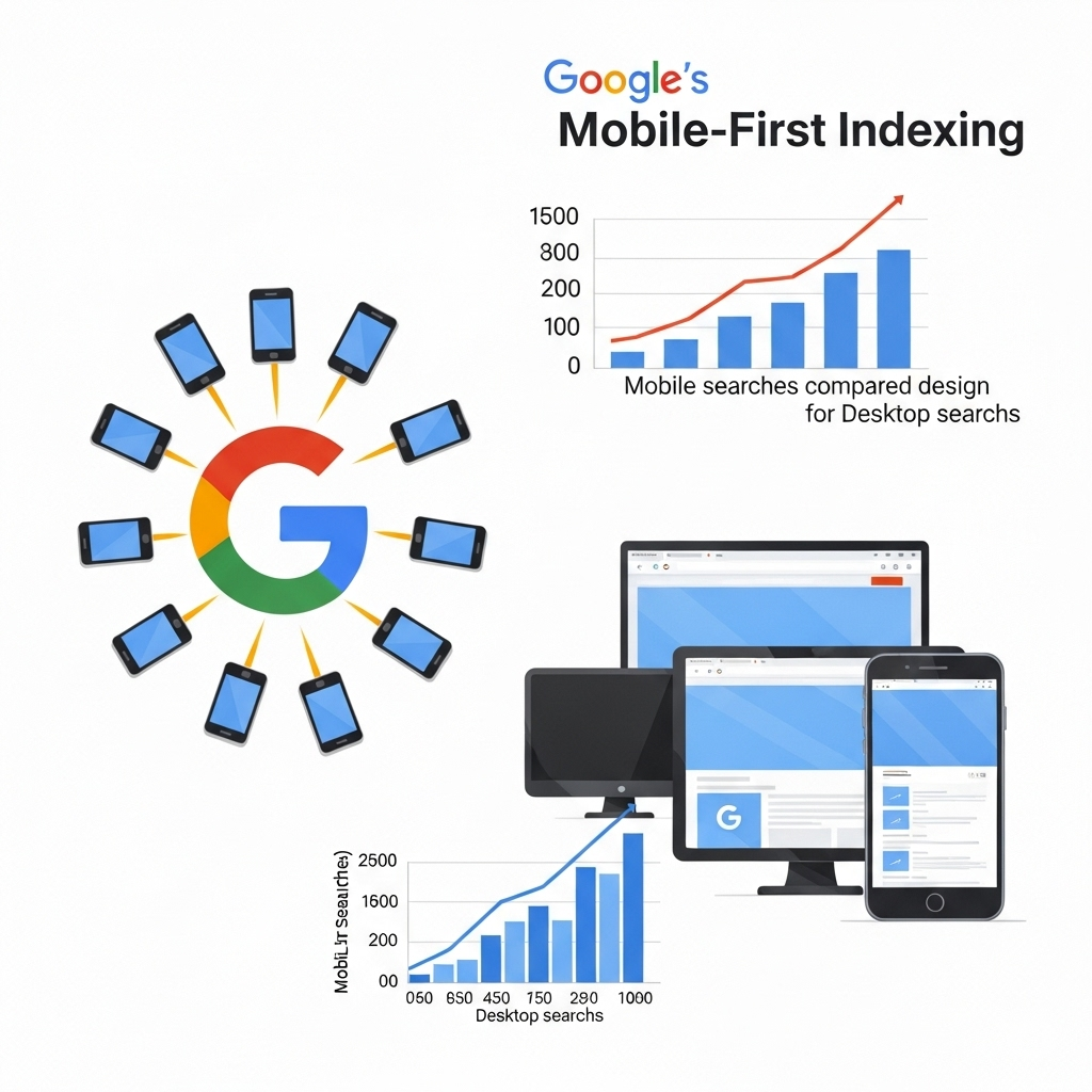
Since Google now indexes the mobile version of your website first, responsive design plays a major role in your search engine rankings. A mobile-optimized site is an SEO must
.
3. Better User Experience

Visitors are more likely to stay, browse, and convert when your site works smoothly on their device. Poor navigation, slow loading, and unreadable text lead to high bounce rates.
4. Increased Conversions
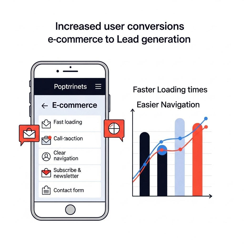
From e-commerce to lead generation, mobile users are more likely to take action on a site that feels fast, intuitive, and easy to use.
Key Features of a Mobile-Friendly Website
To ensure your site performs well on mobile, include these essential features:
- Responsive design layout
- Large, easy-to-tap buttons
- Readable text without zooming
- Optimized images and fast loading times
- Minimal menus and clean navigation
How to Make Your Website Responsive
If your current website isn’t mobile-friendly, here are a few ways to make it responsive:
- Use a responsive template or theme – Most site builders like WordPress, Wix, and Shopify offer mobile-ready themes.
- Test your site’s mobile performance – Use Google’s Mobile-Friendly Test to identify issues.
- Compress images and optimize code – This improves page load speed on mobile networks.
- Avoid pop-ups and Flash – They don’t work well on mobile and frustrate users.
- Simplify design – Remove unnecessary elements and focus on what mobile users need most.
To sum it up, what is mobile web design? It’s the practice of ensuring your website looks great, loads fast, and functions seamlessly on mobile devices. In 2025 and beyond, it’s not just a design trend, it’s a business necessity.
Whether you’re building from scratch or redesigning your current site, responsive mobile design should be a top priority. For expert help with web design, digital marketing, and branding, partner with professionals who understand today’s mobile-first world like Cardan Marketing Solutions. We help brands stand out with websites that perform beautifully on every screen.